Wednesday, December 8, 2010

The Kiss - Test Proof

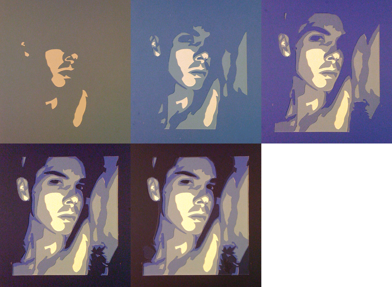
When testing out an image I use pre-cut mat boards 16"x20".  The designs cut into them are generally no bigger than 10"x16" because the wide black border makes the colors appear brighter.

Here I oversized the image and cut the border down to just 1.5".

Wednesday, December 1, 2010

Concrete Tabletop

At the urging of a friend I took a class at 3rd Ward, an enclave of artists that teach classes in woodworking, web design, welding, etc.

One of these classes, "Concrete Creations" said it would teach students the basics of formworking and casting concrete.The class description said the goal was to make a small, 16x16" tabletop.

In essence we were all casting nondescript concrete blocks that were flat and wide.  We used acrylic to form the top, and laminated plywood for the edges with a bead of silicone caulk at the corners.

The most interesting element of the class for me was that the instructor had a formula for calculating by volume the precise amount material to mix for a given mold.  I'd previously only done it by "feel" and "eye".
The class was informative and worth it for that alone, but my aesthetic view differed from my classmates.  Everyone was interested in getting their cast top highly polished, and that seems anathema to the idea of concrete.  I enjoy its grey imperfect surface.  I even cast recessed imperfections into my top.

The recessed panel in the center of the above piece is identical the recessed panel in the concrete flower pot, but it's been cut apart to give it a straight-edged organic look.  It's a simple method to add visual complexity to an otherwise straighforward design.

Monday, November 22, 2010

Company Holiday Card


Photograph by Khaliq Sharpe

Even though it wasn't within my job description, I was asked to design a company Christmas Card.  I chose a complex, uninteresting site photograph with a group of men working.  Using photoshop I "painted" santa-style hats on the men, and falling "snow" on the rest of the image.

The punchline came inside the card, "Not all elves build toys."

This card won me a backpack.

It turns out, our insurance company, which insures more than just general contractors, holds an annual holiday luncheon during which they display all the cards they receive in December.  The employees then vote and award a prize for the one that celebrates the holiday season and best exemplifies the work of the submitting company.


Card Interior


Lego Business Card Holder

The NYU job fair was an education in marketing give-aways for me.  I didn't expect the TP to be something people would want to take home with them.  In fact some even asked for bags - too embarassed to be carrying around a roll of TP.  This served as the basis for the next give-away.

Lego, the popular toymaker created software called Lego Digital Designer - in essence AutoCAD for Lego models.  Users are allowed to select individual Lego bricks and position them in space to construct a model.  As it's created, the program keeps a running total of the cost of the model.  Upon completion, the program uploads the model to the Lego website which sends you a bill for the bricks, and a week later, a package arrives in the mail with exactly the pieces needed to build the model.  This program would have been a dream to my 10 year-old self.

The cost of the business card holder was $7.33.  We bought small plastic tube-like containers to hold the pieces of the set, and created our own Lego-style pictures-only instructions for assembling the piece.  In addition a company business card was included in the package.

In order to customize it, we had stickers created that fit on a key block on the front, and the mini-figure's torso.  The goal was to make it look as though he was wearing a company t-shirt.

In all, 150 of them were created, and were only used once, given away at a charity event at the Lake Mahopac Country Club in 2008.

It should be noted that Lego does not in anyway endorse this.
The packaging, the pieces, and the completed model.

Tuesday, November 2, 2010

Concrete Oil Candle

Most of my concrete work with candles involves building a box or shade of sorts around an ordinary votive or tea light.  This was an attempt, like the Concrete & Glass Oil Candle, in order to create a casting that would be more than just a shade.

The candle was cast in two parts, with a hidden glass well in the lower portion and a glass tube containing a fiberglass wick in the upper portion.

This casting is notable because it was done very early, predating almost all of the stained glass work.  It was the first time I didn't chamfer the edges of the mold to allow for an easy de-mold.  All edges are for the most part, ninety degrees.

Parsons Cube Tabletops


Pre-cast concrete tops installed on West Elm Parsons Cube Side Tables.

 I bought two Parsons Cube Side Tables from West Elm to use as coffee tables.  I figured they were small enough to move around or adapt to other uses, and at the same time sturdy enough to put my feet up or sit on.

Unfortunately the finish on the veneer shows marks rather easily so I initially planned on adding additional coats of finish.  Instead I cast concrete panels that would fit on top of them.

I've often considered creating decorative wall panels or actual tile out of concrete either as something that could be mass produced or as one-off works of art.  I resist partly because it seems too easy to create a shallow mold where the artwork, while still three dimensional, is more about fields of texture in bas-relief.

I arranged the tables so that one of them was pulled forward to their respective midlines as shown in the photograph to the right.  The concrete planter with its square shape fit nicely on one of them.

The tops I cast would have to respond to the planter, because I wanted to keep it in that location.  For a while the design actually included a recess so that the planter would "lock-in" to its intended location.

Because I was going to need more than one top, I decided to go with using the rubber casting material I had used previously on the Concrete Pot and the Concrete Oil Candle.  It saved me no time because while casting the second top didn't involve the creation of a second mold; making the original mold out of rubber involved several additional time-consuming steps.  I only used the rubber material to insure that both tops would be identical.

The steps involved creating an original negative mold out of foamboard.  Several pictures are included below.

Original negative mold in progress.


Completed negative mold.

Negative mold filled with Polytek 7420.

Completed postive cast full scale being demolded.


Final rubber positive cast.

 Once the rubber had solidified enough to remove it from the mold, it took several hours to get the foamboard off it, even with liberal amounts of release agent applied to the mold before casting.

The picture to the left is a rubber full scale model of what the finished product would look like in concrete. 

This model was then placed in a foamboard box and the very same casting material was then poured on top of it.  This would create a rubber negative mold essentially identical to the one I built out of foamboard in step one.

This is the finished mold on the right.  Polytek 7420 as a casting material will bond with itself unless a release agent is applied in between the positive and the negative.  While I did apply the relase agent I wasn't as precise as I should have been insuring that it got into all of the grooves on the positive object.  This resulted in several tears in this casting when it came time to demold.  Fortunately its effects on the concrete casts were minor, and the defects in the mold itself are correctable.


One of the cast finished pieces is shown at the right.  It has a few minor imperfections related to concrete mixing, but overall, and considering that it was completely hand made, I'm happy with the result.  There was some concern that the grooves (which get deeper toward the center) would compromise the panel structurally, but this appears to not be the case.
The picture to the right is the very first concrete panel to come out of the mold.  I set it next to its rubber prototype to get a sense of the spiral pattern I was looking to create across the two tables.  The color variations on the concrete are the result of water still evaporating from it.

In order to better protect the finished product I applied Aqua Mix water-based "Stone Enhancer" as a finish.  This doesn't affect the appearance but it gives the material a slightly waxy texture.  I don't normally finish my concrete work with any sealer because I like the look of the raw material, and most sealers will change the color, sheen or texture of it.  In this case I did so because they would likely be subject to the occasional food or beverage spill

Monday, November 1, 2010

Company-Branded T.P.

After reading the book "Your Marketing Sucks" by Mark Stevens I was motivated to completely change the kind of marketing materials that my company puts out there.  Both the president and the marketing department were less than enthusiastic about my vision.  Even though this was for work it was outside my area of responsibilities at the time, and a clear output of my underworked creativity engine, so I'm including it here.

I think the picture to the left is provacative enough to almost not-need any sort of text.  It opens the door to all sorts of possibilities.  When the company president asked me what it means I flippantly replied "Servicing assholes for seventy-five years." He laughed and then said, "no way."


Almost a year later my boss told me that the company was going to have a table at an NYU job fair, and I should come up with something.  Since I was given only forty hours notice it was my decision to go ahead with the toilet paper, much to his initial dismay.  We made about thirty of them, and  changed it so that it had more information than the company logo on it.

The back of the label reads, "Performing construction work in New York requires you to deal with a lot of $#!+.  Maybe you need to work for a construction company that knows how to clean it up."  They were just stacked on our table at the job fair to attract attention.  I never intended anyone to take or keep them, but we ended up giving away a couple dozen.


Sunday, October 31, 2010

The Pyrite Crystal

When I was younger I was a rock and mineral collector.  Although that interest has faded, I'm still fascinated by the intricacies of crystals, especially when half buried in other strata.  Sulfer dioxide, also known as iron pyrite grows naturally in several different crystal configurations.  Because I imagine such a thing as "concrete crystals" existing as cubes the form of fool's gold that interested me the most was its cube form.

This cast was a simple 2"x2" cube with recessed panels, made in such a way to receive a single crystal piece of iron pyrite.  The dimple visible on top of the metal is the corner edge of a second crystal growing out of the first.


Slots were cut into the buried edges of the crystal.  The concrete of the cast filled these slots effectively locking the crystal in place.

Thursday, October 28, 2010

The Shadow Hug - Cutting

This is the finished work based on the previous test.  It measures 30"x40".  The two biggest changes (aside from its size) over the test cutting for the same image are the increase in the level of detail, and the change in color.

The former was a natural function of the increase in size and helps to make the work more photo-realistic at a distance.  The latter was based on the earlier interest of showing the models blond hair.

The more cuttings that I've completed the more aware I've become how sensitive the finished work is to the color selection of the mats that make it up.

Of all the various elements of the work, what I'm most proud of is his right arm.  It is being backlit by the reflection of the wall behind him, the far edge of it is bright right where it meets the shadow (which means the cuttings go deeper to the lighter colors).  The contrast of the light and dark in proximate adjacent spaces on his right arm, and in his hair were difficult but worthwhile effects.

The photograph to the left is a straight-on picture of the detail of his hair and face.  Note that his eyes are nothing more than black pieces cut horizontally across his face.


The photo to the right is an off-axis shot of the face and hair detail allowing one to see the layers.

The work is based on a photograph taken by Abreum Garcia of the model John Hoover.

John Hoover - Test Proof

I came across a photo of the model John Hoover taken by Abreum Garcia of Gamafotos.com

Because of the high contrast value, and the detail of his frontal muscularity I thought it would make a good cutting.

The image to the right is a 16"x20" test cutting, done in the same blue shades as the previous tests.

I didn't realize it at the time, but what really stands out for me in this work is the model's blond hair.  The  test just about, but not quite, conveys that he is fair-haired.  It became the starting point when I set about creating the finished work.

The image to the left is a photograph of the mat cutting in progress for this test.

Wednesday, October 27, 2010

Lordosis Behavior - Cutting

This was another test cutting on a complex image.  I especially like the chiaroscuro-esque detail of her shoulder blades.

Ghost - Practice Cutting

This cutting was only done for practice and technique development.  I chose the photograph because of it's simplicity and high contrast value.  I also liked that the upper right corner was completely obliterated in shadow.

Tuesday, October 26, 2010

It's Him or Me - Test Proof

In order for me to sell the cuttings I needed to rely on photographs that were more professional than the ones I'd been taking.

Dylan Rosser, a well known photographer of the male nude form was one of the first to give me permission to create a cutting.  I chose to create a cutting of his photo of the British model Charlie Rawlins.

The image to the left is a photograph of my proof.  The shades of blue I had used for the Troy Cutting worked very well together and have since become a method I use to test how well an image translates into the medium.  Dylan Rosser models typically have a sheen on them and high contrast which makes them particularly suited to my interpretation.


Like the Nude Female and Nude Male sample cuttings, each of the mats is laid one on top of another, cut out to show the colors of the mats underneath.  When viewed at a distance it reads like a photograph.  Lest anyone think that the above is a trick of the lens or me playing with an Adobe photoshop function, the picture to the right is of the same work taken close up and off axis.  It allows you to see the 1/16" thickness of the individual layers that make up th entire image.  Because I was satisfied with the colors and the work in general I was prepared to go ahead with the final version of the cutting that would measure 30"x40".
Although I liked the colors of the test-cutting and originally decided to execute the final in similar colors, that didn't workout the way I wanted.  A photograph of the attempt is shown to the left.  The tonal difference between the fourth and fifth layers was too great.  It was never glued together and the pieces of it were destroyed when I completed Charlie in 7.


Monday, October 25, 2010

The Retirement Card

When one of my coworkers, whom I much admired, chose to retire, I wanted to do something for him.  This measures 16"x20" but I deliberately kept the cutting portion of it small so that all of those that worked with him would have enough room to offer up their farewell wishes.

The Open Candlebox

 The candleboxes with the stained glass were continually cracking so I wanted to be sure that it was the glass that was doing it.  In order to test that out I cast a candlebox that had no glass.

One Christmas I made a series of them as gifts for friends and family.

The two major differences are that it's made out of ordinary concrete - portland cement and play sand in a 1:1 ratio with a lot of water (I had to be sure that the mix would fill the mold) and the web on top.  Concrete can withstand a great deal of heat, and most candle lanterns are completely open at the top in order to dissipate the heat.  I thought it would be interesting if this one had a web on the top similar to the ones on its sides.

The votive candle within is small enough to fit through the webbing on one of the sides to allow for insertion and removal of the candle and its glass jar.

This cast was done in a single pour, not assembled from separate casts.  The box which formed the center opening was made of foamboard.  In order to demold the cast, this box had to be cut up through the concrete webbing and taken out a piece at a time.

The Playhouse

The scale is difficult to gauge in this picture.  The door is just over 5' tall.

A coworker's daughters were quickly outgrowing their commercially available backyard plastic playhouse.  He asked me to design a bigger replacement - something he'd build himself.  The only requirement was that it be less than 8' in all dimensions.

The result was a simple gabled box 6'x6', 8' tall.  Two of its adjacent sides have one foot bays, one of which extends another foot to form a "porch".

A few months after he finished building it, he sold his home.  His daughters' affection for the playhouse, and his own sweat equity motivated him enough to rent a crane and truck large enough to move it to the backyard of their new home.

Sunday, October 24, 2010

The Troy Cutting


Image of the various layers, each laid on top of the next.
 Having worked with nude forms, both male and female, I was curious to see how much detail I could solicit from the cutting method as a medium.  In particular I wanted to see if I could do a cutting that was detailed enough to identify the model.  I chose a self portrait by my buddy Troy. 

The mats measure 16"x20" but the cutting itself is only 10"x12".  The top black layer extends outward to form the framing mat.  The lightest shade, a light grey is probably too light, but overall I was happy with the result.  The face in the finished work is easily identifiable as Troy.

To the left is an animated gif showing how the individual layers build up the image.

Friday, October 22, 2010

The Second Cutting - The Male Nude

While the 16"x20" was acceptable for determining if the colors and the image were suitable, I really wanted to create something larger, 30"x40".

In order to show more detail I added another layer, bringing the total to six, black being the one on top, and then five shades of brown/beige down to an offi-white.

The size of this 40"x28" made it somewhat unwieldy to cut and glue together, so much so that looking back on it, it reads as fairly crude.

The original photograh required a lot of retouching and photoshop play in order to get it to where I wanted it to be for translation into a cutting.

In addition, this work more than any other laid bare for me how important color selection was in the choice of the mats.  I bought and cut the mats, and then realized that the bottom two were too light compared to the top four.  I inserted a color between layers three and four and recut the lower ones.

 In the photo on the right you can see the stark contrast between layers three and four.
Some friends have suggested that I deliberately leave layers out, especially the darker ones, which adds an ambiguity as to the subject matter.  I'm on the fence about this.

I generally enjoy that from a distance or if slightly blurred my work which is neither a painting nor a photograph can easily be mistaken for the latter.

The First Cutting - The Female Nude

I set out to decorate my apartment with work that I created.  After several hours painting only a few square inches and being displeased with the result I thought there had to be a faster way.

I remembered hearing that Van Gogh, in his later years when his vision was failing, took to cutting out paper to create his work, and I had recently read about the artist, Brian Crede, similarly using cut paper to create not just pieces of his work, but the entire image.

Using paper seeemd to be a great way to quickly create a large work, and I had a lot of wallspace to fill.  So I set about testing it out.
Each layer is lighter than the one on top of it and darker than the one below it.  The cut out portion of one reveals the colors of the ones underneath, giving it a sense of depth.  It reminded me of my earlier single color paintings; each layer representing a single shade of a different color in between the extremes of black and white.

The piece above, measuring 9"x12" is the first result,  a nameless woman's torso, cut out of matboard (not paper in the strict sense of the word) which served to stiffen the piece and give it a visual depth.  It was fairly simplistic and my choice of colors wasn't the best.  Even at a distance I don't think the image is all that clear.  One family member mistook it for a tree.

But if I squinted at it or stepped back far enough to make it blurry, the original image was still discernable, if less than perfect, so that kept me motivated.  A few months later another family member asked me to recreate the work, bigger and in different colors.

In order to make it more clear about what the subject matter was I inserted a layer to see if it would provide more detail.

Additional layers do provide more detail but the more of them there are, the more difficult it is to control the relationships between them, and the more precise my cutting needs to be.

The second version of this work measures 16"x20".

Wednesday, October 20, 2010

Concrete Pot

I've done a lot of mental designs for outdoor concrete flower pots, but resisted casting them because of having to address the freeze-thaw issue of the weather.  In addition even moderately sized pots tend to be fairly large. I've only completed two.


The planter above was built using the same wooden mold as the cube fountain and measures 12" on each side.  There is a .5" reveal on the bottom to give it the look of "floating" above the ground.  The recessed "woven" patterns on the sides are created by the same random-cut method used on the the conference room logo.  But here I used Polytek 7420 rubber casting material to create four insert panels in the box of the mold.

This is the rubber mold used to create the molds of the side panels, and one of those panels.
My earlier concrete pot suffered a mold failure during the casting process.  Although it was built true and square, the pressure of the concrete in the mold caused it to bulge.  Unfortunately this bulging non-squareness is visible in the finished work.  On the bright side, it is because of this, that I deliberately built a wooden box to hold the required cube shape of both the planter above and the cube fountain.


Concrete Tea Light


While making the earlier candleboxes I became fascinated with the surface texture of the concrete lit by candlelight.  In this box, instead of trying to pass the light through it, either by glass or with slots, I wanted to create something where the flame would illuminate the concrete itself.  A slot cut in the top allows the heat and smoke to escape.  It measures 4" on each side.


Sunday, October 17, 2010

Stained Glass


The most difficult thing about traditional stained glass panel making is cutting and grozing the individual pieces.  Even though I didn't need precise cuts in order to construct the candleboxes, which was my goal when I purchased the glass, I nonetheless decided I needed practice and took an eight week course on cutting and assembling a stained glass panel.  The design is not my own, but considering it was my first work in the medium, I think the finished product is pretty good.

Pieces cut and laid out.


Cut pieces edged with copper tape, awating soldering.